Branding & Logo Design
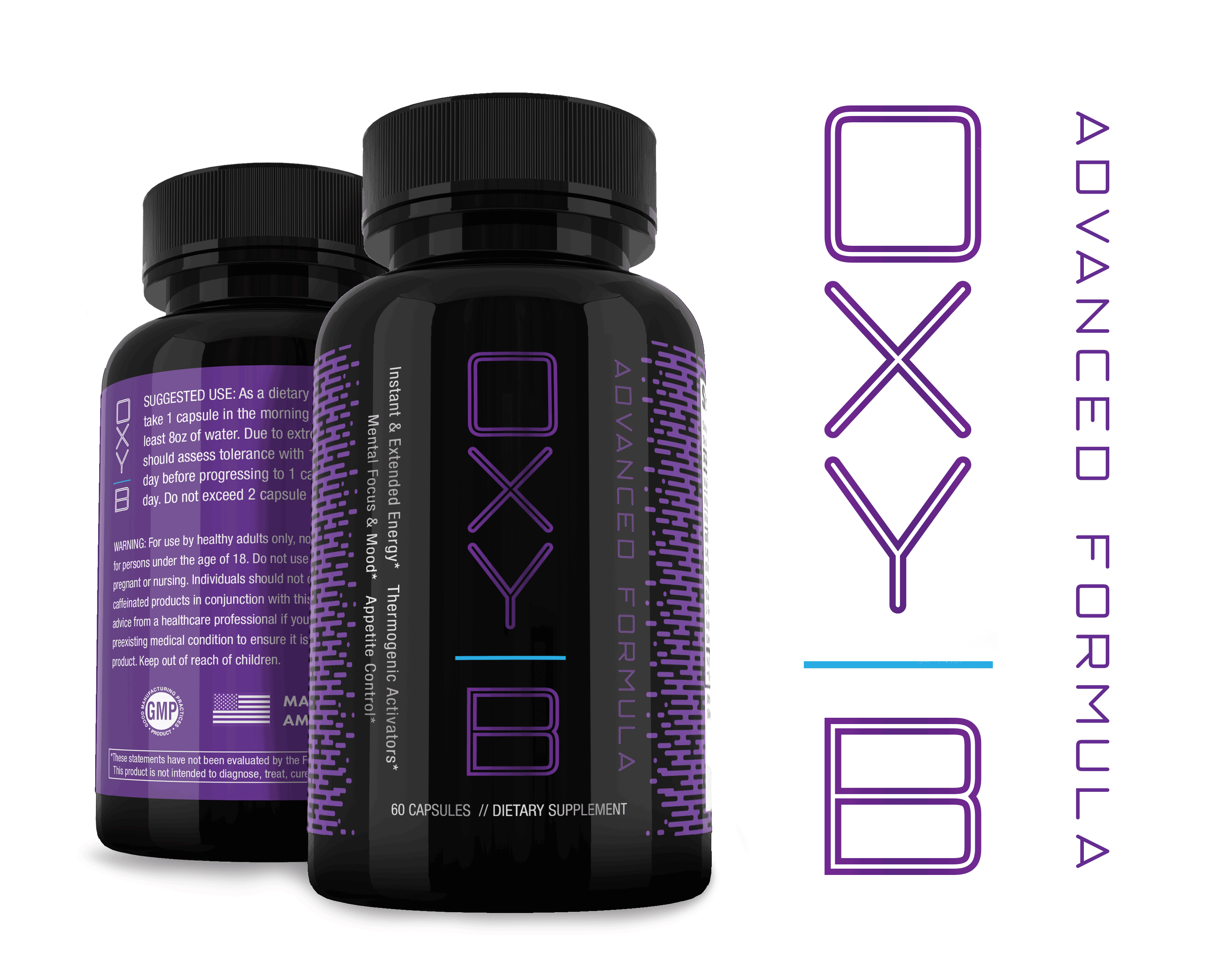
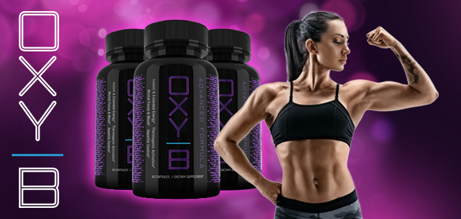
OXY – B
The OXY – B package was modeled after the women’s trends in active sports products. Clean but a slight edge and not afraid to use purples and pinks to catch the eye.

Branding & Logo Design
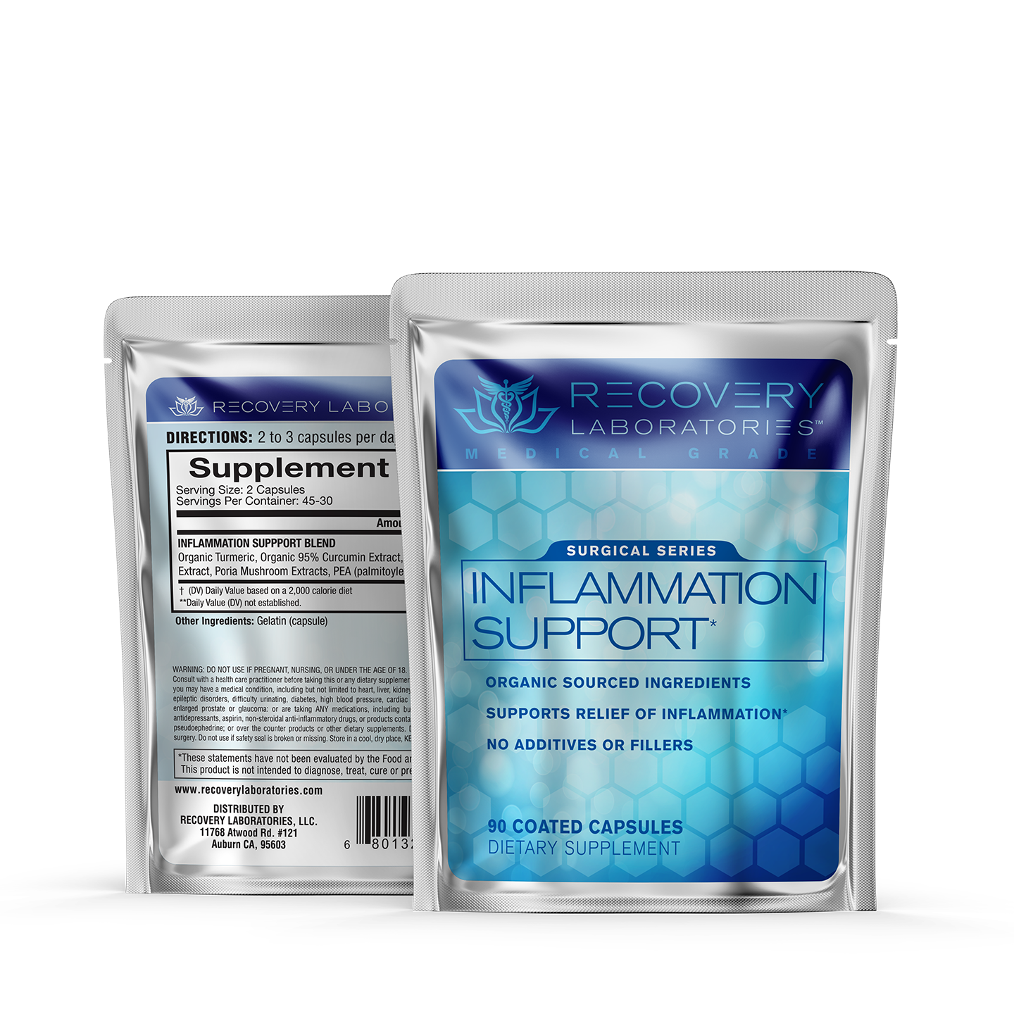
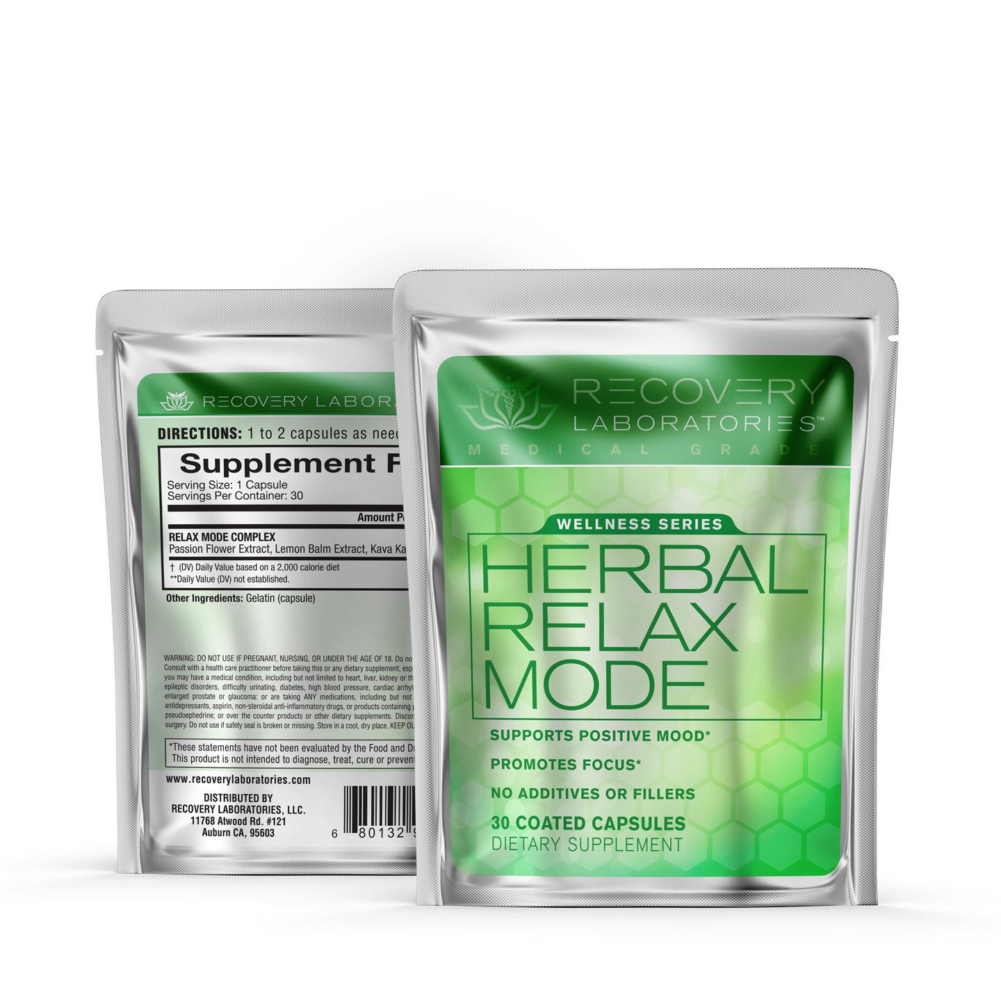
Recovery Laboratories
As a niche brand, Recovery Labs pride themselves on high quality supplements independently sold directly to consumers. To illustrate their well respected medical background with herbal and botanical healing expertise, the logo incorporates the caduceus with a lotus flower. Slick yet simple packaging extends their professionalism and caring approach.
Branding & Logo Design
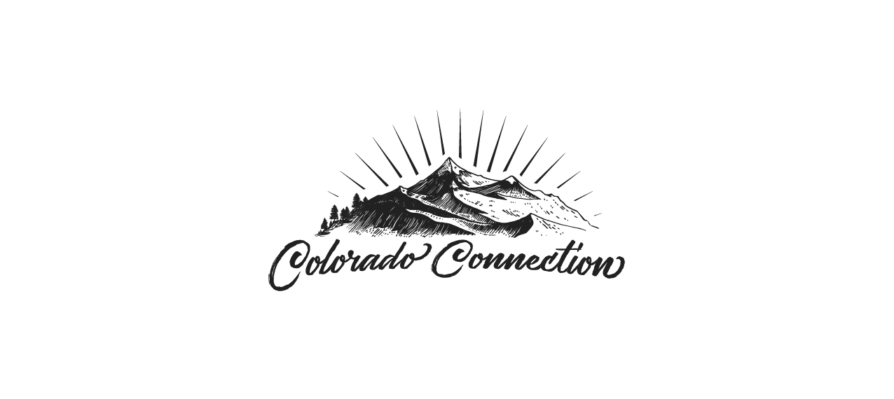
Colorado Connection
A Hemp Oil Manufacturer with a keen sense of down to earth style needed a logo that illustrated their roots. Born and bred in the mountains of Colorado, their products are based off traditions and iconic surroundings known only to Colorado.
Branding & Logo Design
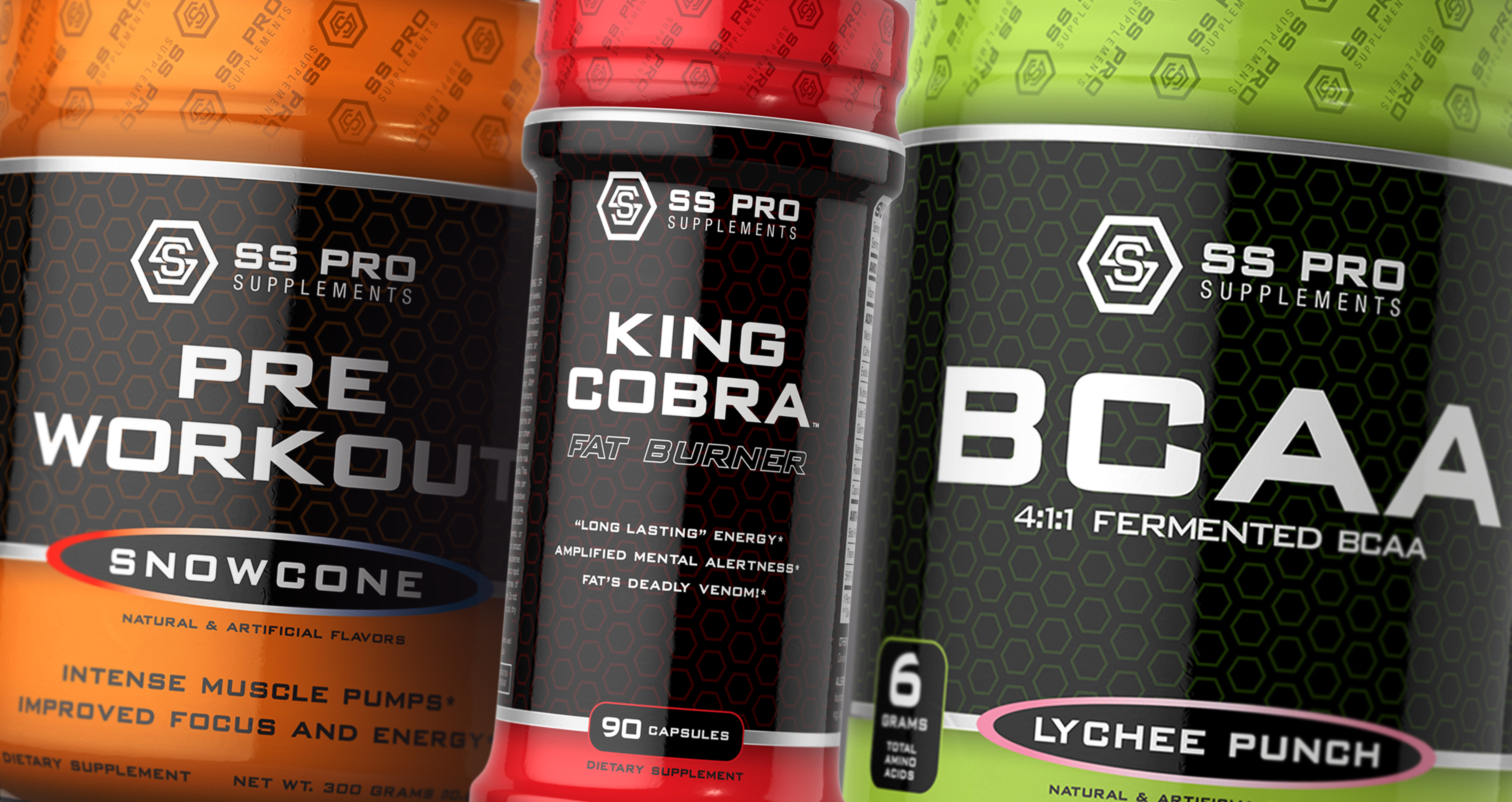
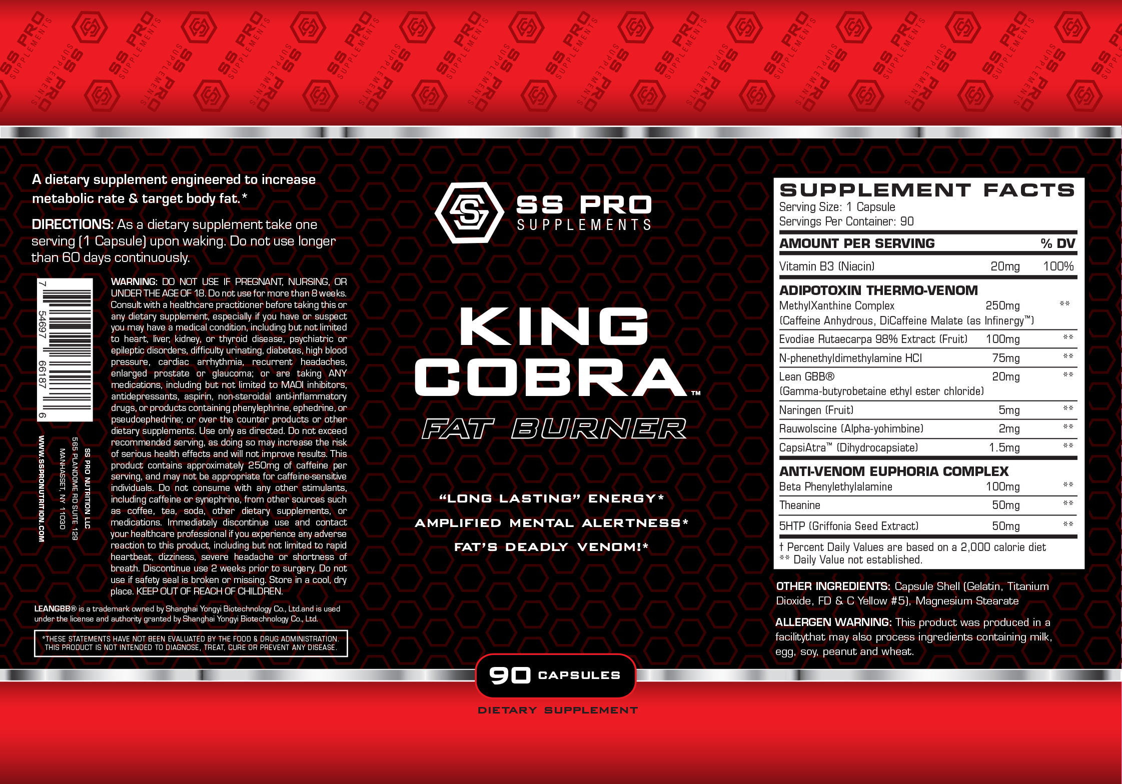
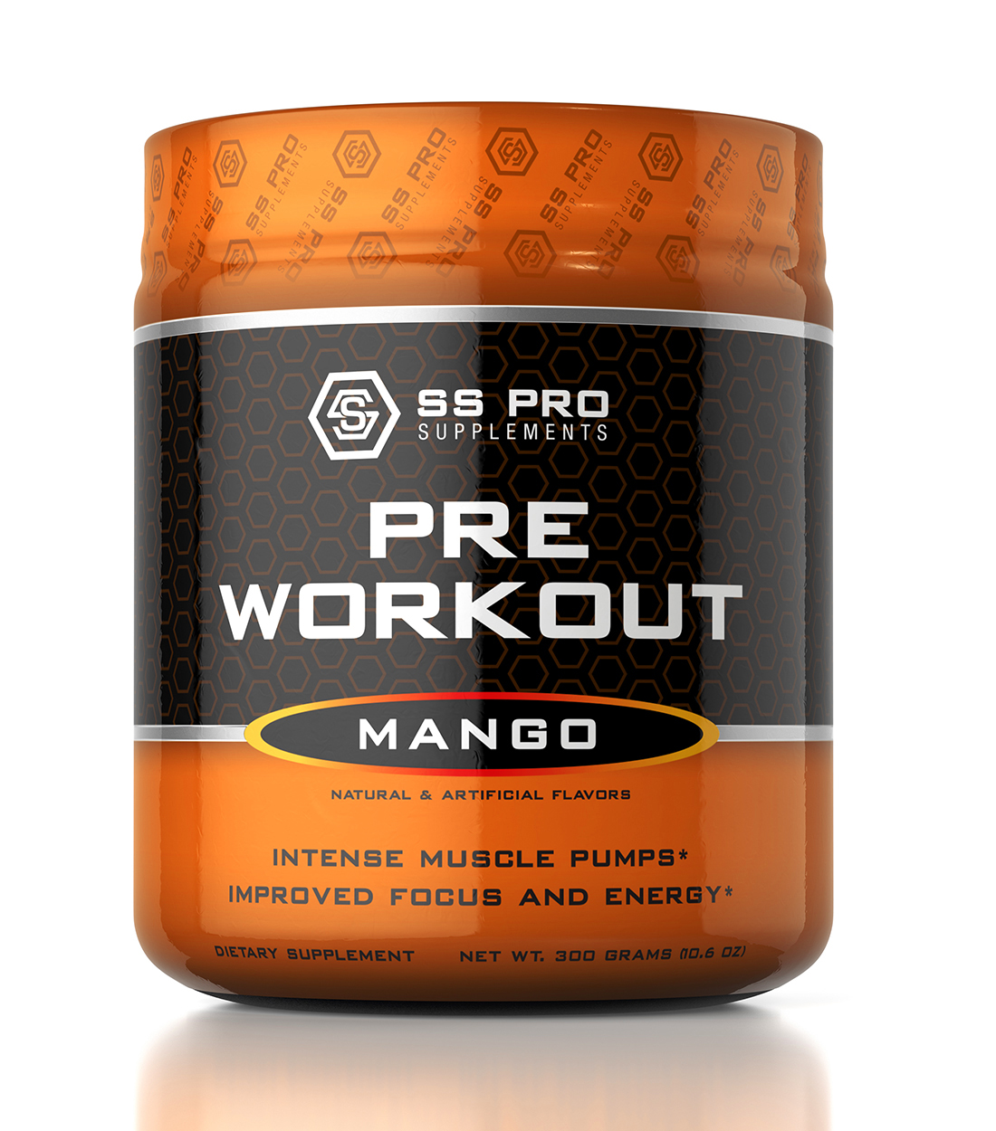
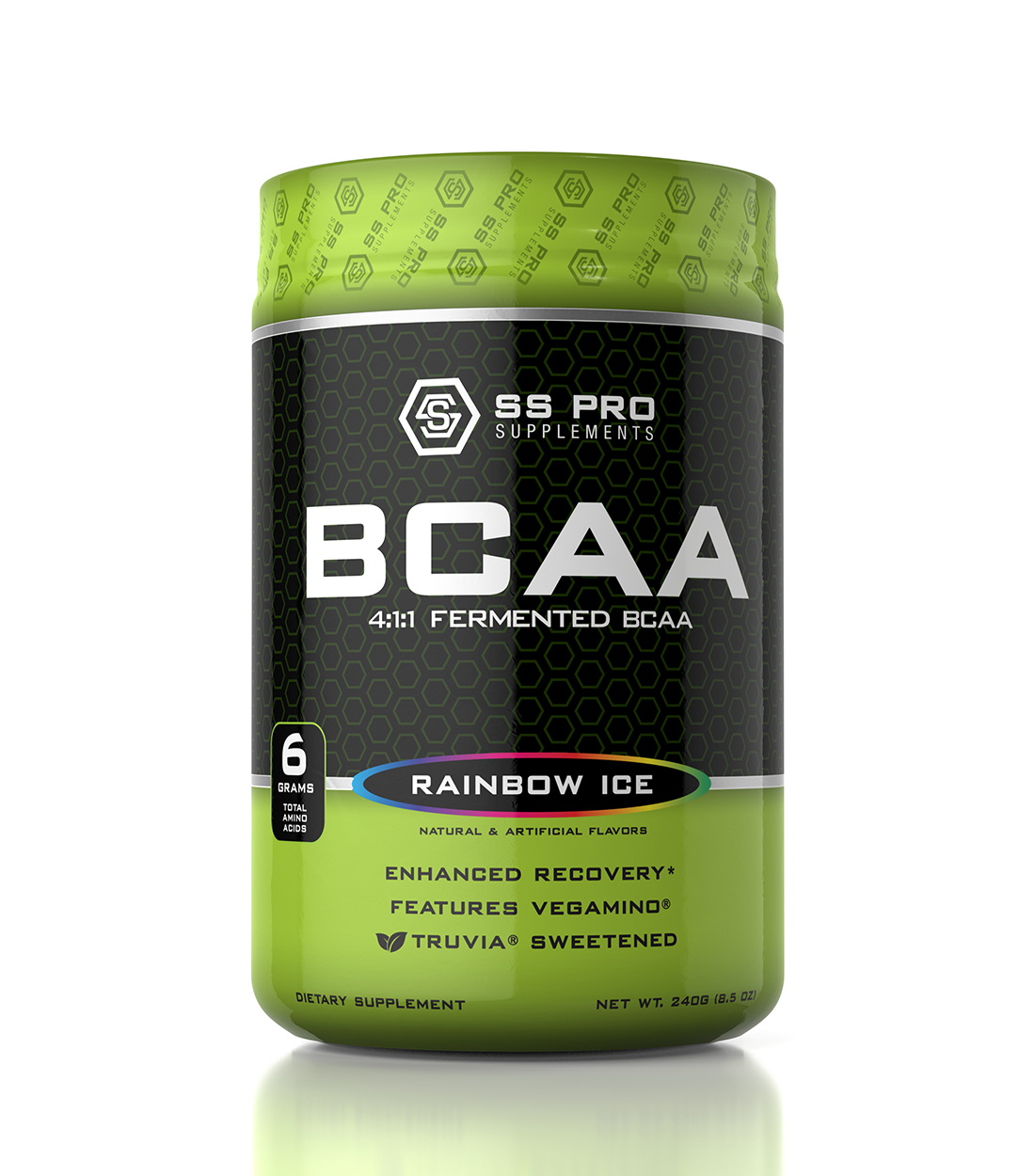
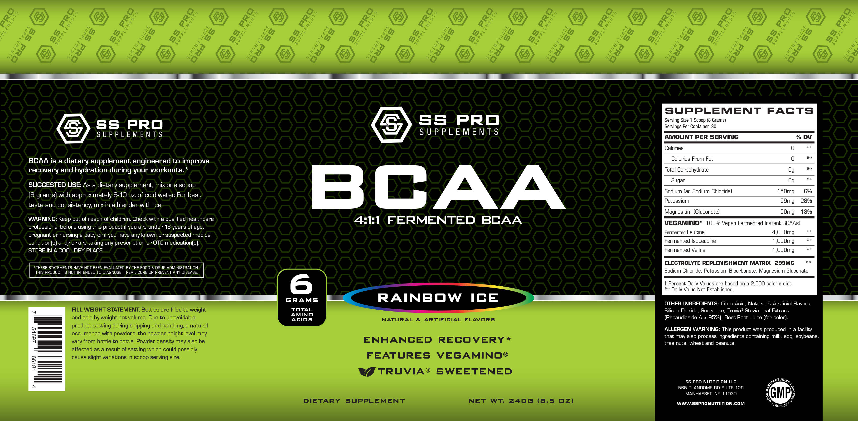
SS Pro Supps
An India based supplement company geared towards high quality ingredients and sold only in specialty stores and through distributors. It was crucial for the logo and label design to reflect the heritage of India with a clear sports influence.
Branding & Logo Design
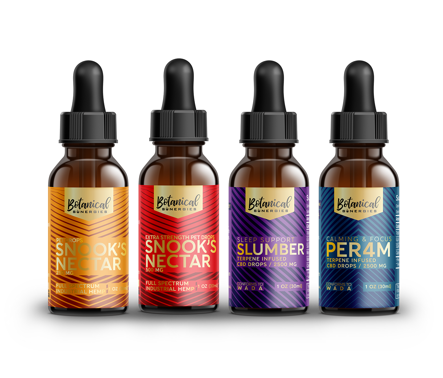
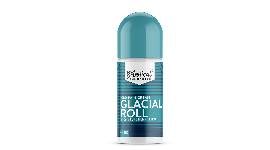
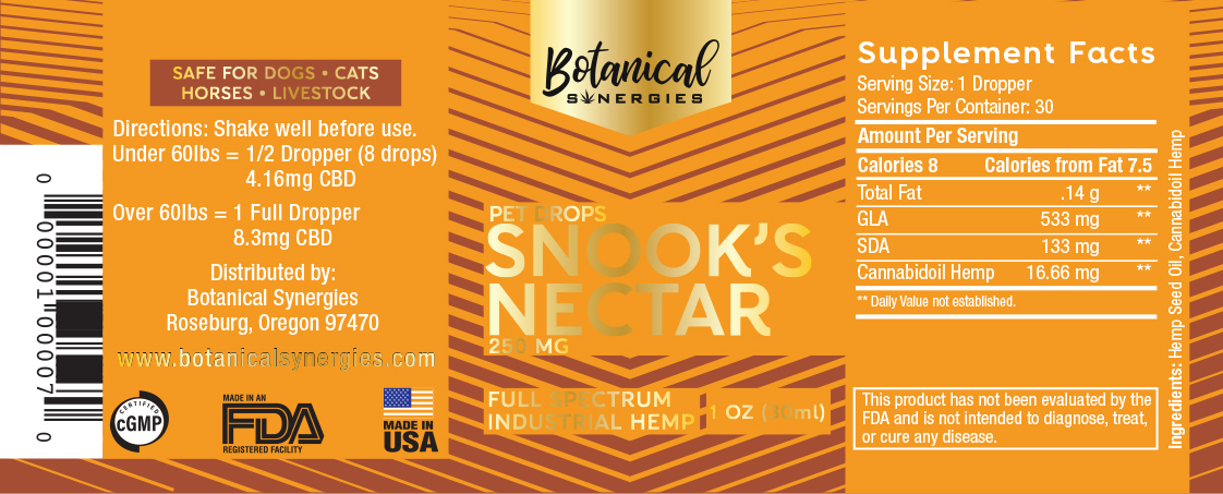
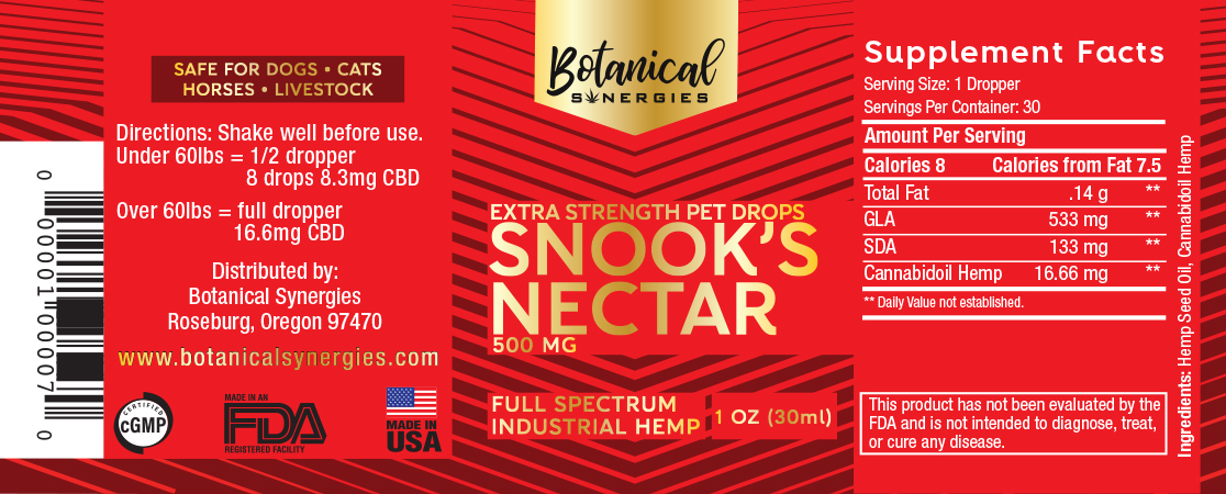
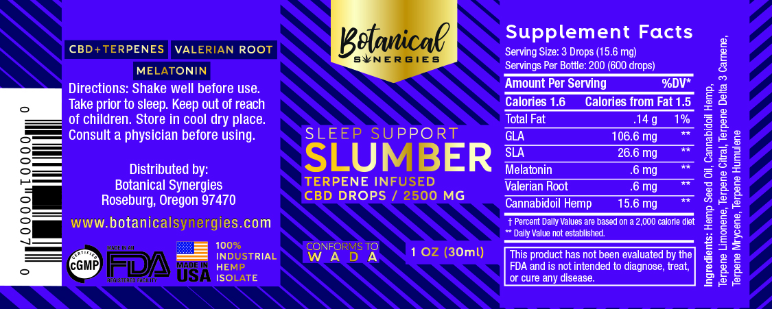
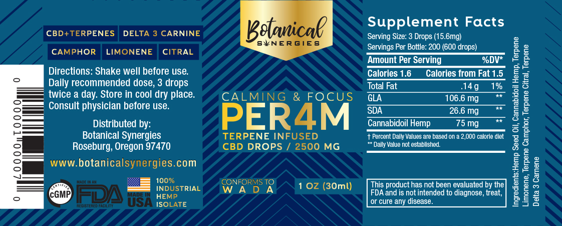
Botanical Synergies
Botanical Synergies are a cutting edge CBD manufacturing and distribution company based in Oregon. Their formulations and manufacturing processes are that of a pharmacy but with an Oregon approachability that had to be reflected in its logo and product design.
Branding & Logo Design
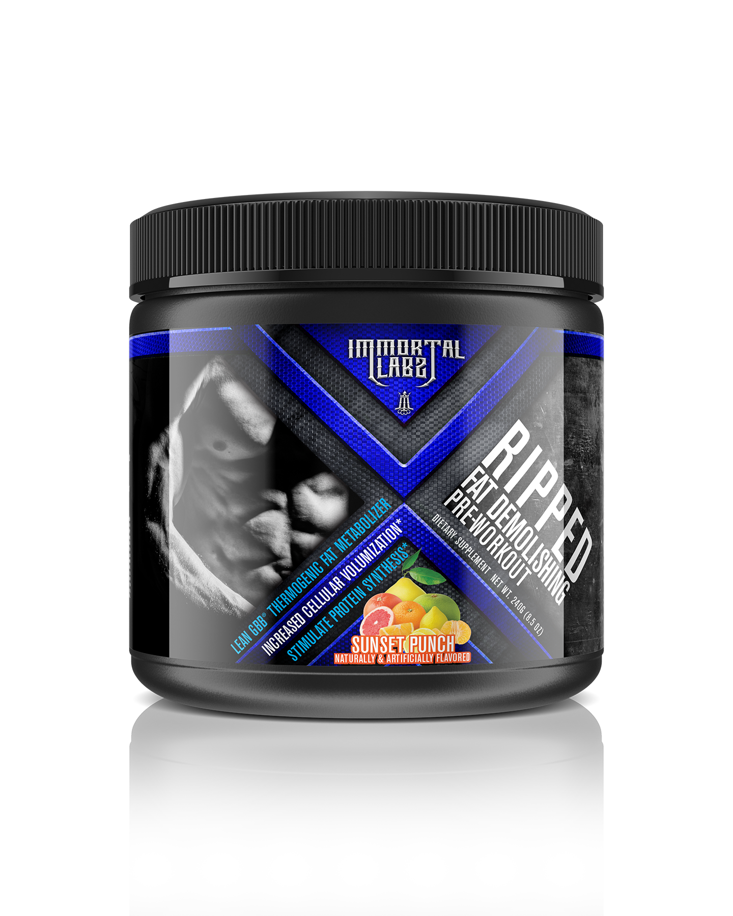
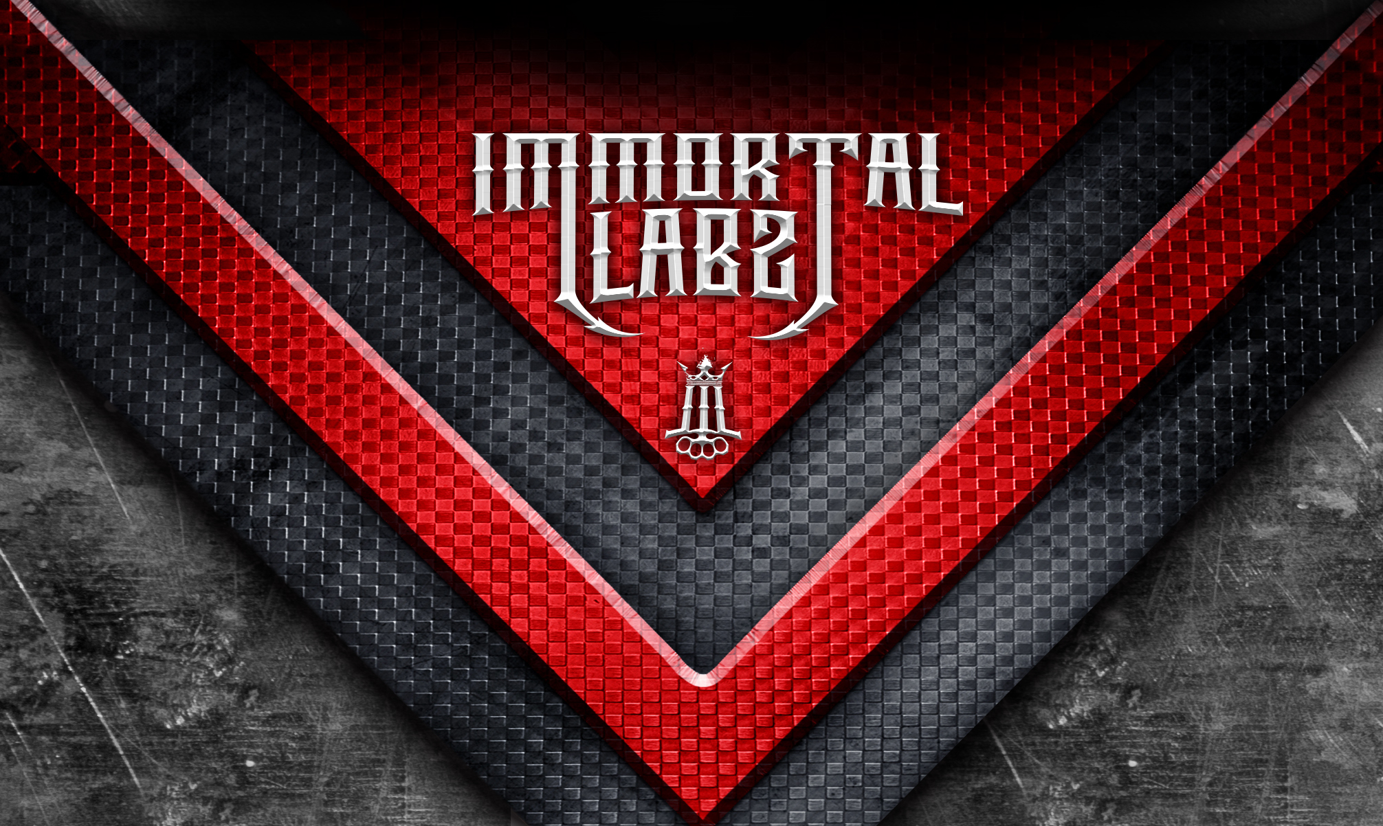
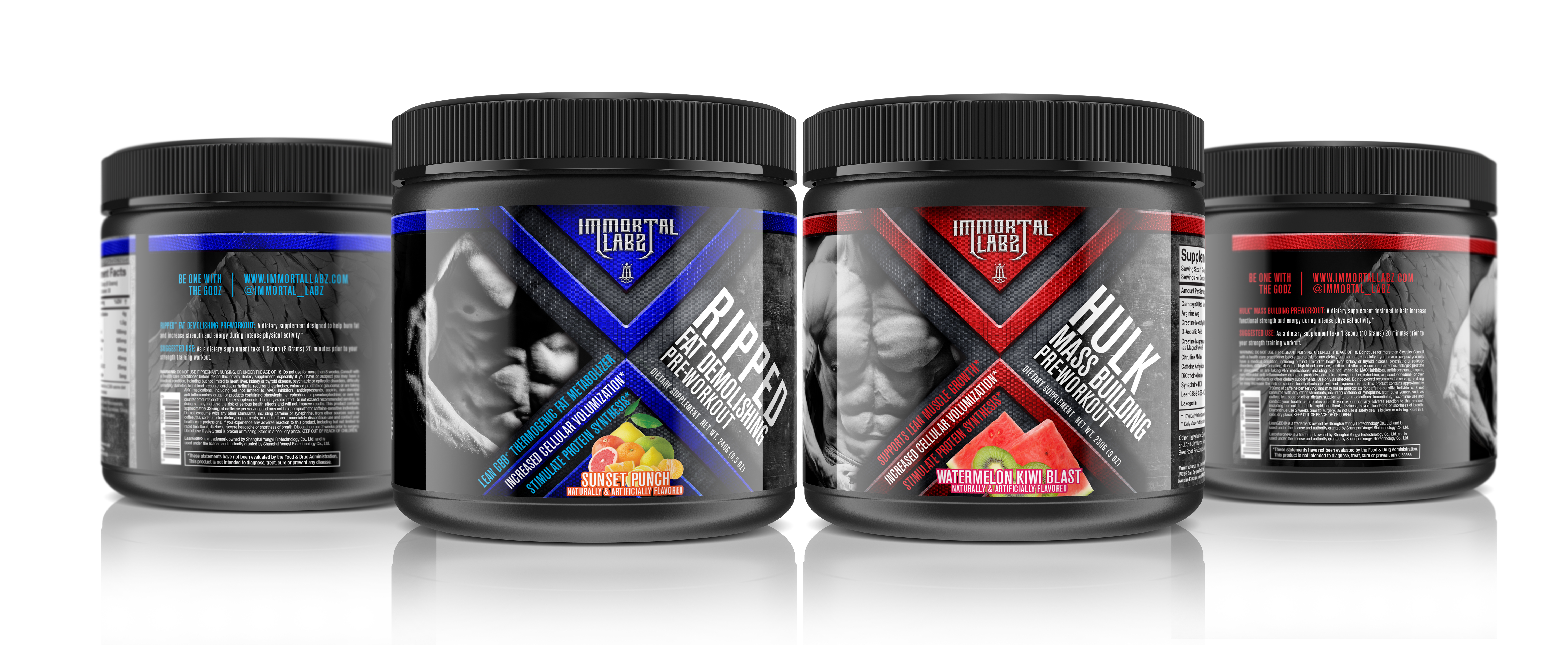
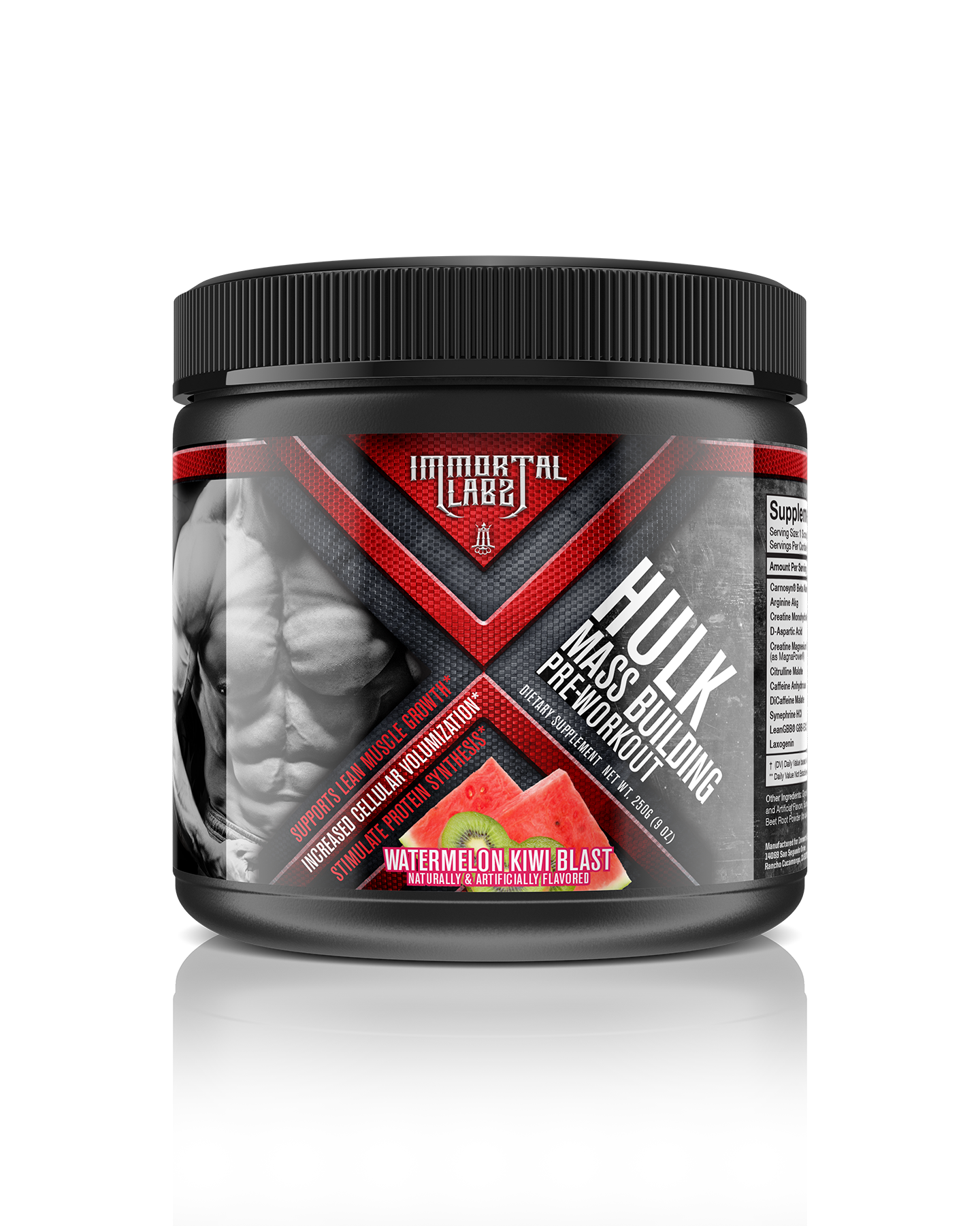
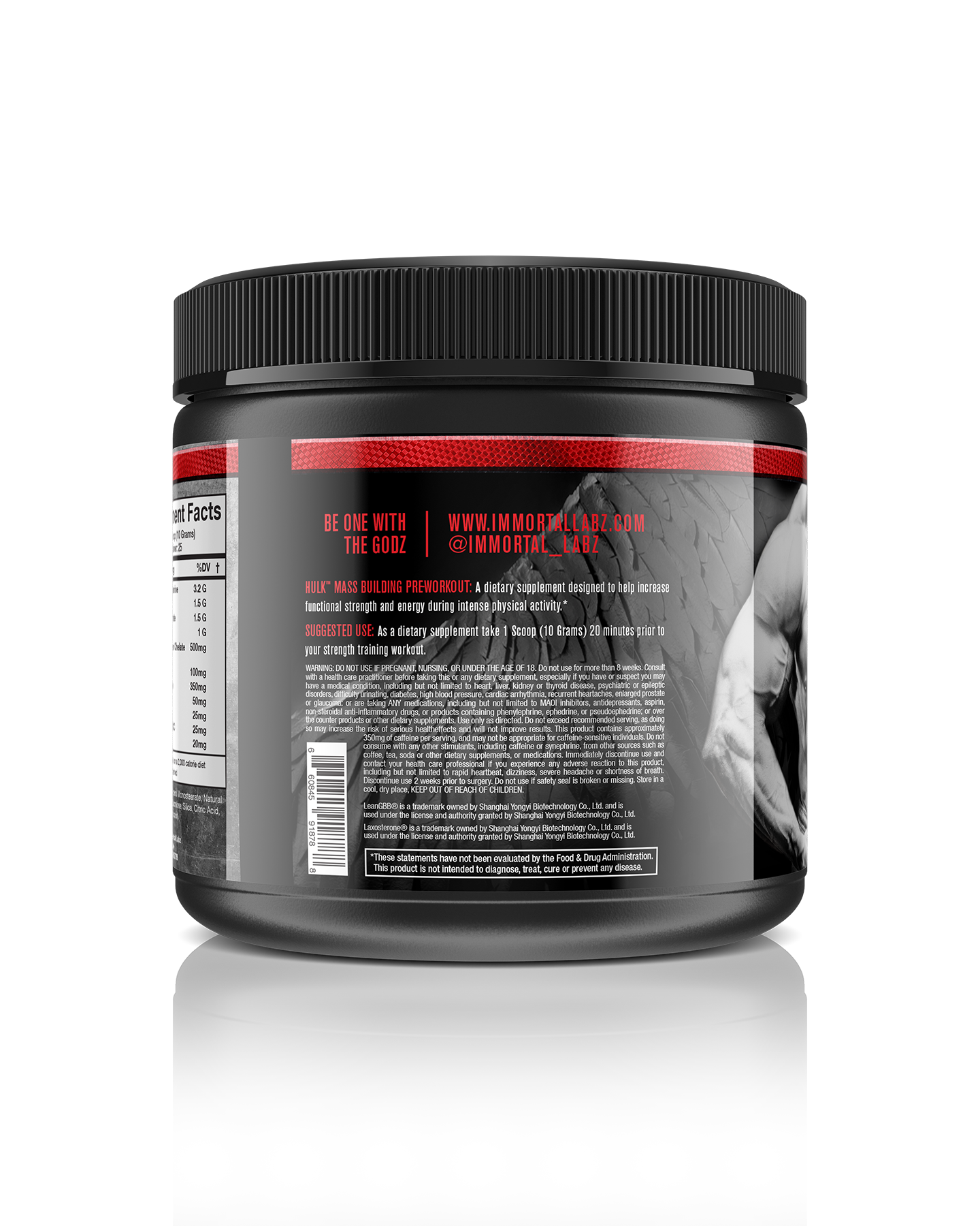
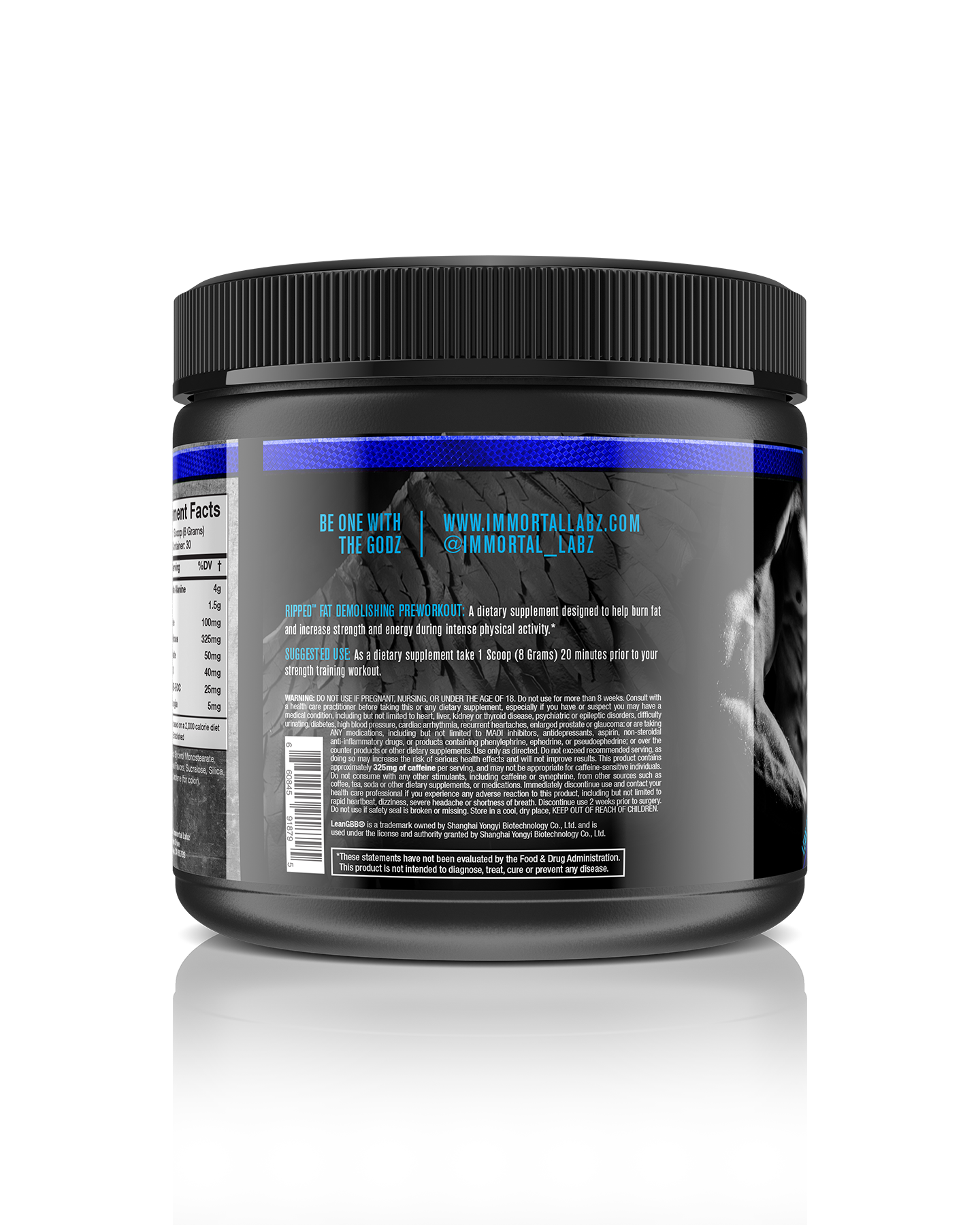
Immortal Labs
Original logo and label design based on client concept of good & evil. Logo is comprised of all parts of what a badass brand should be made of… brass knuckles and an icon that stands on its own.
Packaging Design
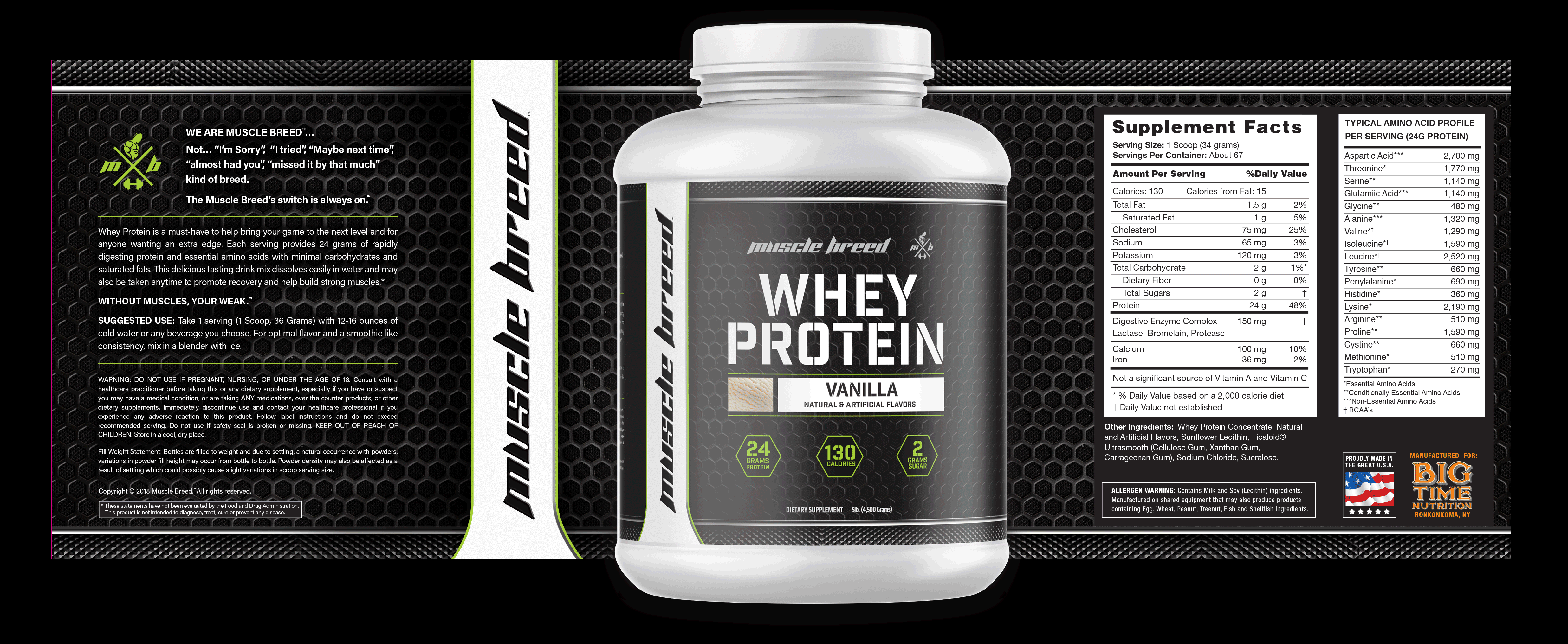
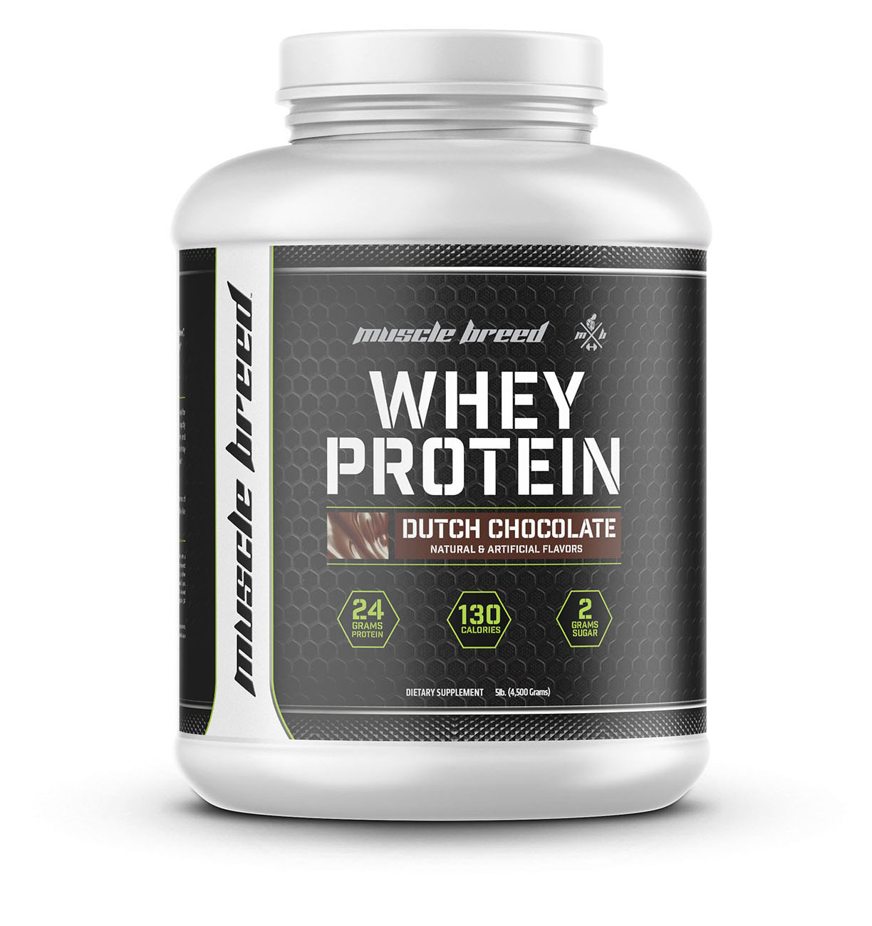
Muscle Breed
A hardcore body building brand with a mainstream approach to fitness and nutrition. Their New Line of supplements needed to reflect that smash mouth look but be a go-to brand for anyone interested in living the lifestyle. Using the knurled bars from weight lifting and a honeycomb cage background the design was successful in reaching its target audience.
Logo Design
Belgiorno Family Mobile Wood Fired Pizza
For the Belgiorno logo, it had to say what the company is about and stay unique in its style.
A rustic touch to the type and brick play off the embers of the wood fire.